


DAX Visuals, Titles and Slicers
Part 5: DAX DAX Visuals, Titles and Slicers

Welcome to Part 5 of the series on Global Trade, DAX Measures and Visualization Finalization. I’m just about done with this series. Here is each part so far:
I’ve also written a fair amount on DAX In the past. I’ve written an basic DAX guide as well as specific posts on the calculate() function, using variables, and the switch function.

In Power BI development, an enormous amount of emphasis is put on DAX because of its complexity and its flexibility. You can do so much with DAX, if you have to. But here’s the thing, if you’ve done earlier stages of your development right, you can usually get away with minimal DAX function.
An aside, instead of using the SWITCH() function demonstrated below to create a dummy slicer, I could also just unpivot my import, export and trade balance columns and use the categorical column generated from that.
DAX is often used as a crutch for unclean data or a bad data model. When developing a report from scratch, you shouldn’t have that. You should follow best practices by having Tidy data in your tables and a Star or Snowflake schema.
The times when I have to do crazy things with DAX are usually when I need to make adjustments to a legacy report. Years of built up “quick-fixes” done by multiple analysts have turned the data tables and data model into a swamp. No one wants to clean things up for fear that there is something that will break if it is done. I’m not worried about that here.
The Plan
DAX works best if you have clean data and a good data model, because DAX primarily just filters and aggregates data to show it in a new way.
In this post I’m going to go through building out DAX calculations for four things:
DAX for switching between imports/exports/trade balance
DAX for growth metrics
DAX for targeted metrics
DAX for dynamic titles
DAX for Switching Between Imports/Exports/Trade Balance
The purpose of this function is to create a custom slicer that functions much like a slicer based off of a categorical column. But instead of slicing by country or product family, I’m going to slicer by metric.
Main metrics in this report are imports, exports and trade balance. I’m interested in changes to these metrics but don’t really have room for line charts plotting the values of each all on the same page. Providing that I am fine with using the same visuals to show the same things, a custom slicer using the “switch” function is exactly what I need.
I wrote a whole post of the switch function here. I’m going to do this but with Import, Export and Trade Balance.
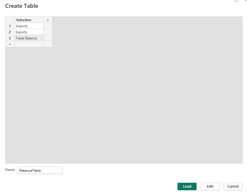
The first thing that you need to do is create a table. Click “Enter Data” at the top of the report page.

I named mine “MeasureTable” which has a single column “Selection” with the options “Imports,” “Exports,” and “Trade Balance.”
Now its time to create the DAX measure:
DynamicMeasure =
VAR MySelection = SELECTEDVALUE(MeasureTable[Selection])
VAR ReturnValue = SWITCH(
    TRUE(),
    MySelection = "Imports", SUM(fact_table[Import])
    ,MySelection = "Exports", SUM(fact_table[Export])
    ,MySelection = "Trade Balance", SUM(fact_table[TradeBalance])
)
RETURN ReturnValue
This is a measure named DynamicMeasure. Its uses two variables, MySelection which is equal to whichever individual selection of the Selection column of MeasureTable was made. The other variable is ReturnValue which switches between a sum of imports, exports or trade balance depending on what the value of MySelection is.


DAX For Building a Growth Metric
I also want to show changes over time. While you can get a rough estimate just from a visual, I want to be able to show how our main metrics are changing over time. I’ll need DAX again to calculate this growth metric.
Here’s what that looks like:
Growth (Year) =
VAR DynMeasureCurrentYear = TOTALYTD(
    [DynamicMeasure], date_table[Date]
)
VAR DynMeasurePrevYear = TOTALYTD(
    [DynamicMeasure], DATEADD(date_table[Date], -1, YEAR)
)
VAR ReturnValue = DIVIDE((DynMeasureCurrentYear-DynMeasurePrevYear), DynMeasurePrevYear)

Return ReturnValue
Again I’m using variables to give my DAX measure structure and make it easy to troubleshoot. I’m using the TOTALYTD expression as well as the DATEADD function and the DIVIDE function to get a sum of current YTD values and YTD values from the previous year and comparing them.
I then use RETURN to return the ReturnValue which is my comparison.

I got visuals both showing the growth rate broken out by category and how that growth rate is changing over time.
DAX for Creating a Targeted Metric
Next I’m going to create a DAX measure that will show a specific metric. This metric will be one of the metrics at the top of the dashboard page. I love outerspace and SpaceX and I want to specifically see metrics showing changes in Spacecraft over time.
Here’s what that DAX function looks like
SpaceCraft Segment Recent Year =
CALCULATE(
    [DynamicMeasure],
    dimSIC[Segment] = "Spacecraft",
   date_table[Year] = MAX(date_table[Year])
)
This function takes the DynamicMeasure (which is the sum of exports, imports or trade balance depending on which is selected in the slicer). It then filter every instance of dynamic measure down to instances where the Segment in dimSIC is “Spacecraft” and the date corresponds to the maximum year in the date table. The end result is the sum of imports/exports/trade balance of spacecraft.
Alternatively here’s another option…
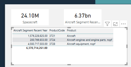
Aircraft Segment Recent Year =
CALCULATE(
    [DynamicMeasure],
    SEARCH("Aircraft", dimSIC[Segment], 1, 0) > 0,
    date_table[Year] = MAX(date_table[Year])
)
This measure is a sort of “fuzzy match” for aircraft. I have multiple segments with “aircraft” in them. Any segment with “Aircraft” returns a value of 1 and any value less than 1 is filtered out of the aggregation.
Here’s what this looks like:
A Word of Caution
If you’re using the search function in a measure, you should verify that you are filtering in the way you intend. Double-checking with a table that pulls in your measure and the specific parts of the hierarchy you think you’re pulling in is the way to do this.
DAX for creating a Dynamic Title
This final major use case for DAX measure is in creating dynamic titles for you pages or for visuals. I do this by:
Creating a Measure that changes dynamically.
Setting a visual’s title to the measure.
Creating a Measure that Changes Dynamically
Here’s my title measure.
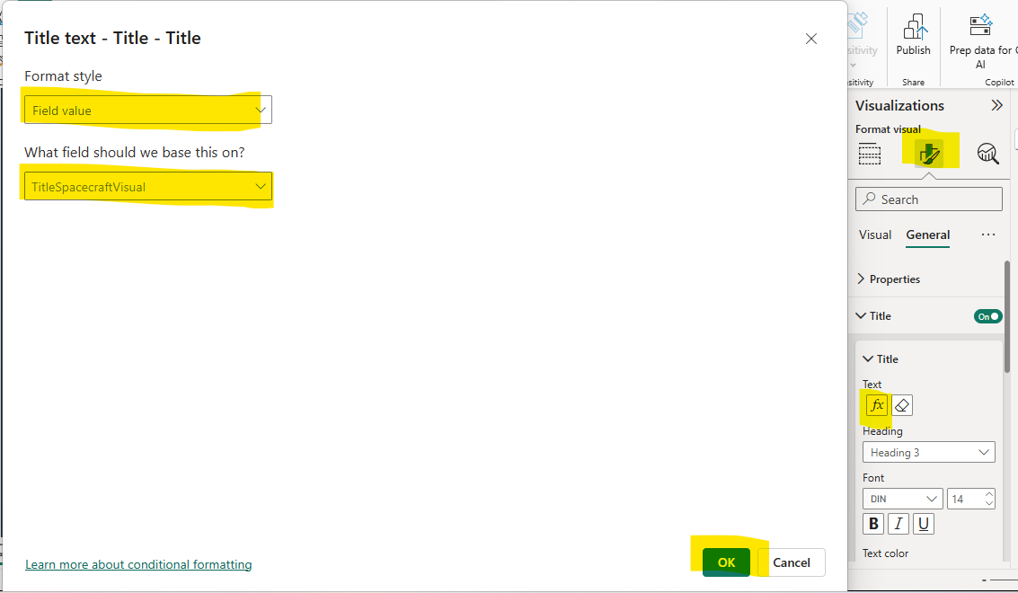
TitleSpacecraftVisual =
"SpaceCraft " & MIN(MeasureTable[Selection]) & " By Year Through " & MAX(date_table[Year])
For organizational purposes, I like to title and “title” measure with “Title” followed by a description.
This measure has four parts, two parts that are static and two parts that are dynamic. Each part is connected with an “&” to combine them. The first part is “Spacecraft “ which will statically display Spacecraft. I then add Min(MeasureTable[Selection]) which dynamically displays whatever filter is selected. “ By Year Through “ is another static portion. MAX(date_table[Year]) dynamically displays the end year.
You can set the title of a visual as a measure like this:
Select your visual, click general and select title.
Click on the “Fx” under text.
Change format style to field value, select your measure and click ok.
Here is the title visualized:
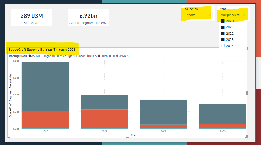
You can see that the name is based off of what year is selected and if imports/exports/trade balance is selected.
This sort of dynamic title changes might seem small, but they really add an air of professionalism to your Power BI report.
Additional Resources
If you’re having trouble with DAX, writing DAX is one of the few Power BI related things that LLMs actually do pretty well. Make sure you understand what your LLM output is doing and spot check the function of your measure with real data. I specifically like to use the official DAX documentation from Microsoft to ensure my measure are working correctly.
Wrapping Up
Here I four ways of using DAX to improve your reports. DAX can be used to create measures which allow you to aggregate and filter data to use in main visuals or in targeted metrics.
You can also use DAX to create custom slicers to filter your data/visuals dynamically.
Finally you can use DAX to create dynamic titles for your visuals or report pages which add an air of professionalism to your report and almost give it the feeling of an App.
I think this is a good place to stop for today.
Until next time.
-BTA