
Data Exploration and Report Design
Visualizing Global Trade Part 4

Part 4 of my series on Visualizing Global Trade is on Data Exploration and Report design. You can find the first 3 parts of this series here:
Data exploration is the process of going through the data and making sure there are no “surprises.” I can do this manually by looking at data tables or by spot-checking basic visuals.

When I say report design, I’m not talking about the aesthetics of the report. I did that in Part 3. What I’m talking about is making decisions on what visuals to use and what metrics to use. I have a basic outline of the process I will use here. The more in depth procedure is:
Explore/validate the data, and determine an overarching narrative.
Build out pages that tell the story with 1-4 main visuals and 4-8 KPIs per page while limiting data on a single page to a unified theme
Data Exploration/Validation
First and foremost, I want to make sure that the data model is working correctly. I don’t want there to be any surprises later on. To that end, I’m going to build filtering/building visuals with the dimensional tables, so I need to verify that the fact table is correctly connected and that foreign keys in the fact table are mapping correctly to the dimensional tables.
This is what that verification process looks like in practice. The dimGeo table has a different source than my fact table. I think it was kaggle with a couple of modifications, mainly the addition of a “trading bloc” column. What this means is that “Country” and “PartnerName” might not match 1-to-1.
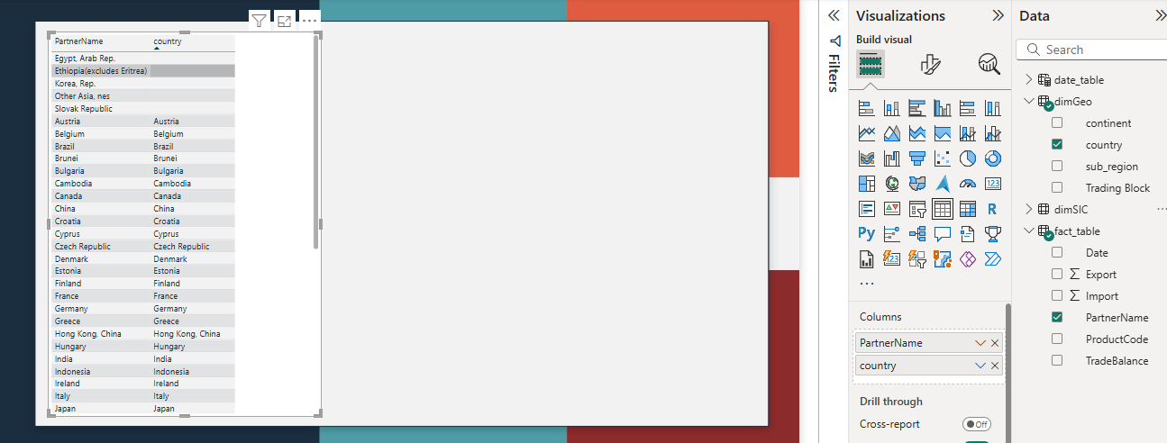
I created a table visualization and brought in the foreign key from the fact table and primary key from the dimensional table. I then sorted the table by dimensional table primary key ascending. Any blank values for the primary key are values in which there is a value that exists in the fact table but not in the dimensional table.
I now need to make a decision, are these values important? Are they major values? If so, what do I need to do to bring them in?
To answer the first question, I added export and import values to the table.
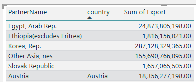
These are all countries with reasonably large export values, they are important. “Korea, Rep.” and “Other Asia, nes” are major values. Googling “Other Asia, nes” tells me that this corresponds to “Taiwan.”
I’ll need to go into Power Query and make adjustments, replacing the values in our fact table with corresponding values in the dimensional table (or vice versa) in order properly match the keys.
In Power Query, go to the fact table, right click on PartnerName and click replace values. Enter the name you want to change and what you want to change it to.
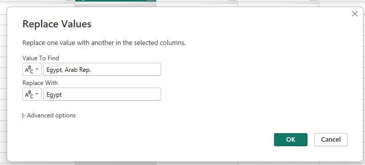
Repeat with all of the countries that need to be changed.
Here’s my adjusted Power Query M-code based off these changes:
let
Source = Folder.Files(FolderLocation),
#"Removed Columns" = Table.RemoveColumns(Source,{"Extension", "Date accessed", "Date modified", "Date created", "Attributes", "Folder Path", "Name"}),
#"Filtered Hidden Files1" = Table.SelectRows(#"Removed Columns", each [Attributes]?[Hidden]? <> true),
#"Invoke Custom Function1" = Table.AddColumn(#"Filtered Hidden Files1", "Transform File", each #"Transform File"([Content])),
#"Removed Other Columns1" = Table.SelectColumns(#"Invoke Custom Function1", {"Transform File"}),
#"Expanded Table Column1" = Table.ExpandTableColumn(#"Removed Other Columns1", "Transform File", Table.ColumnNames(#"Transform File"(#"Sample File"))),
#"Changed Type" = Table.TransformColumnTypes(#"Expanded Table Column1",{{"Nomenclature", type text}, {"ReporterISO3", type text}, {"ProductCode", Int64.Type}, {"ReporterName", type text}, {"PartnerISO3", type text}, {"PartnerName", type text}, {"Year", Int64.Type}, {"TradeFlowName", type text}, {"TradeFlowCode", Int64.Type}, {"TradeValue in 1000 USD", type number}}),
#"Removed Columns1" = Table.RemoveColumns(#"Changed Type",{"Nomenclature", "ReporterISO3", "ReporterName", "PartnerISO3", "TradeFlowCode"}),
#"Pivoted Column" = Table.Pivot(#"Removed Columns1", List.Distinct(#"Removed Columns1"[TradeFlowName]), "TradeFlowName", "TradeValue in 1000 USD", List.Sum),
#"Replaced Value" = Table.ReplaceValue(#"Pivoted Column",null,0,Replacer.ReplaceValue,{"Export"}),
#"Replaced Value1" = Table.ReplaceValue(#"Replaced Value",null,0,Replacer.ReplaceValue,{"Import"}),
#"Multiplied Column" = Table.TransformColumns(#"Replaced Value1", {{"Export", each _ * 1000, type number}}),
#"Multiplied Column1" = Table.TransformColumns(#"Multiplied Column", {{"Import", each _ * 1000, type number}}),
#"Added Custom" = Table.AddColumn(#"Multiplied Column1", "Custom", each Date.FromText("1/1/" & Text.From([Year]))),
#"Changed Type1" = Table.TransformColumnTypes(#"Added Custom",{{"Custom", type date}}),
#"Removed Columns2" = Table.RemoveColumns(#"Changed Type1",{"Year"}),
#"Renamed Columns" = Table.RenameColumns(#"Removed Columns2",{{"Custom", "Date"}}),
#"Added Custom1" = Table.AddColumn(#"Renamed Columns", "TradeBalance", each [Export]-[Import]),
#"Replaced Value2" = Table.ReplaceValue(#"Added Custom1","Egypt, Arab Rep.","Egypt",Replacer.ReplaceText,{"PartnerName"}),
#"Replaced Value3" = Table.ReplaceValue(#"Replaced Value2","Ethiopia(excludes Eritrea)","Ethiopia",Replacer.ReplaceText,{"PartnerName"}),
#"Replaced Value4" = Table.ReplaceValue(#"Replaced Value3","Korea, Rep.","South Korea",Replacer.ReplaceText,{"PartnerName"}),
#"Replaced Value5" = Table.ReplaceValue(#"Replaced Value4","Other Asia, nes","Taiwan",Replacer.ReplaceText,{"PartnerName"}),
#"Replaced Value6" = Table.ReplaceValue(#"Replaced Value5","Slovak Republic","Slovakia",Replacer.ReplaceText,{"PartnerName"})
in
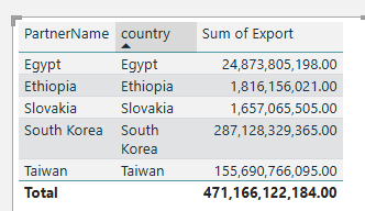
#"Replaced Value6"Here’s the data table now:
I need to repeat this with all of my dimensions, but I’m not going to write about it, instead I’m going to switch gears into report design.
Report Design
Power BI report design isn’t difficult in that each page should have 1-4 main visuals and 4-8 metrics along with slicers. What’s more complex is settling on the visuals to use as well as determining what metrics to use.
In a professional setting, stakeholders, either internal or external have a lot of input into these decisions. Building out a report for fun or as a personal project, I’m the stakeholder.
What I want to show is how America’s trade is changing over time with the ability to drill into the changes by the geographical dimension and the product dimension. Besides the geo and product dimensions, I want to be able to create a sort of “artificial” dimension that will allow me to cycle cycle through imports, exports and trade balance and visualize each. I will use DAX for this in my next post.
Major Visuals
For major visuals, I want them simple enough to be easily understood but complex enough to fully capture all the information. This means combinations of line charts and bar charts.
Line charts and bar charts are great in that they show changes over time and put absolute numbers for each period. Their one weakness is that they require filters to drill into and explore the data. There are other options that allow a user to drill into data while maintaining a logical chain of how the data is being explored. I could dedicate a page to a Decomposition Tree. Here’s what that looks like:
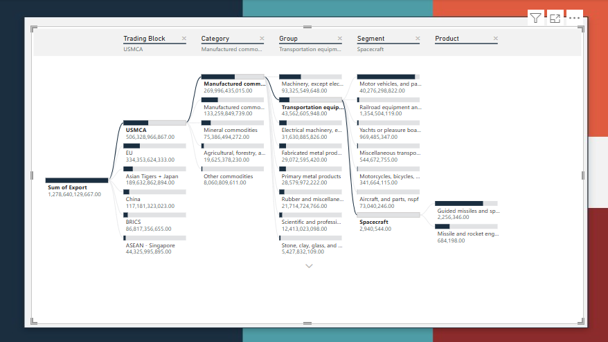
A decomp tree really allows you to drill into your data and see how it breaks down. The screenshot above drill into America’s total exports of 1.2 trillion from 2023. 500 billion of that goes to the USMCA (Canada/Mexico). The largest category is manufactured commodities, the second largest group of manufactured commodifies is transport equipment, the smallest segment of transform equipment is spacecraft and their are two product types, guided missiles and missile/rocket engines.
There is an incredible amount of detail in this sort of analysis.
While a decomp tree is a great tool, it can be overwhelming. Its phenomenal for snapshots but requires additional work in the form of DAX measures to show changes. If I want to show changes and direct attention to changes broken down by a specific dimension, I can always use a waterfall chart. Here’s what that looks like:
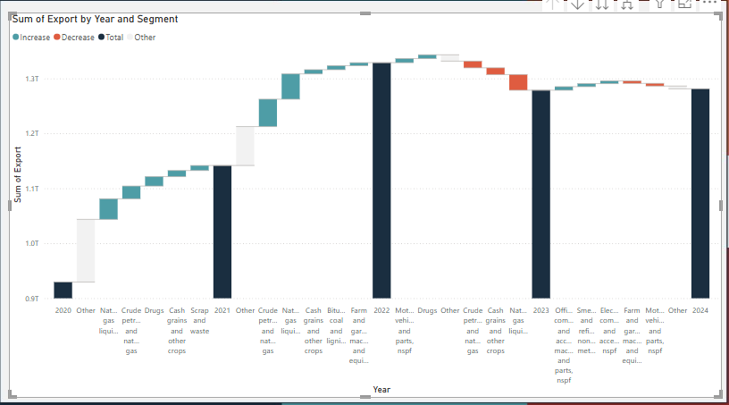
The waterfall chart shows how exports change year to year. It shows major drivers of growth and contraction by segment in green and red and aggregates other drivers as a grey “other.” You can set the total number of drivers to visualize. You can select what dimension to break changes down by. This is a very powerful visual if somewhat more difficult to interpret than a normal line or bar chart.
Metrics
Now that I have major visuals that show broad trends, I need metrics that provide additional detail. My metrics will be exact number or growth rates of strategic products/categories or of the overall import/export trade balance.
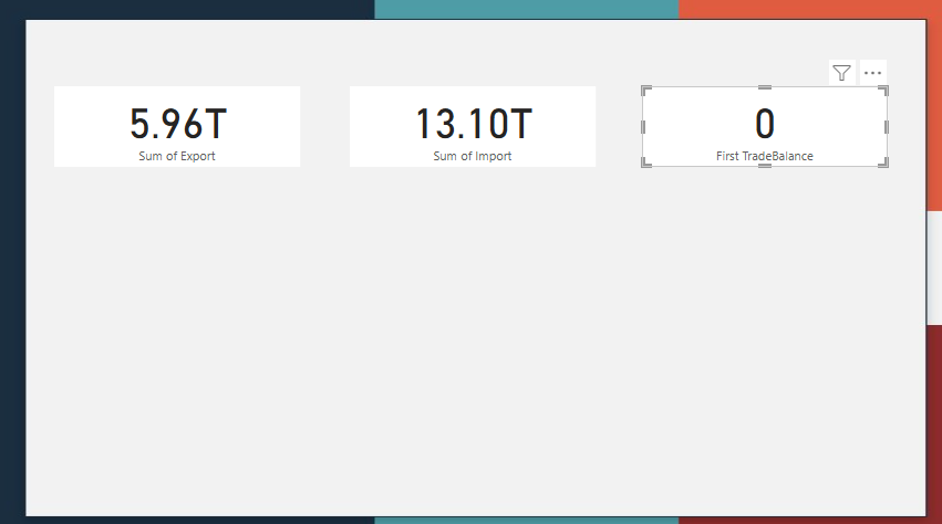
Metrics will be displayed in cards above the major visuals. If I want to display a lot of metrics, more than would fit above the top, I can convert some of my “major visual” space into a table. This might be useful if I want to show a table of export growth rates for each of the hundreds of products.
Slicers
Slicers will help the user drill into major trends by providing a way to filter and dynamically change the visuals on a page. Slicers can be of a singular dimension or hierarchical, depending on your needs.
Slicers should be at the top of your page or on one side.
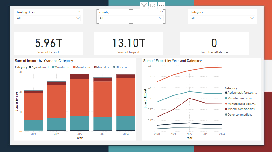
Bringing it All together
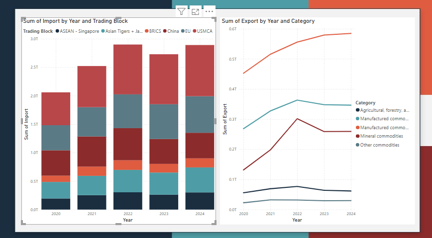
Brining together major visuals, metrics and slicers, this is “final” page (that still needs a decent amount of work).
Wrapping Up
Ok so I did some data exploration and some initial report design. I definitely have a start and the dashboards are starting to take shape. Next post is going to be on DAX, namely using DAX to create specific measures for our metrics and visuals.
You should refresh you memory on DAX usage prior to the next post. You can do so by reviewing my previous post on DAX or by doing some exploration of the topic with your favorit LLM.
-BTA