
Principles of Power BI Report Design

The last 3 posts have been fairly technical, so this one is going in a different, but equally important, direction. I’m going to share tips and tricks for designing effective and aesthetic Power BI Reports. Welcome to Power BI Report Design.
This is part six of a Power BI Overview I am writing. The purpose of this overview is to give you everything you need you create beautiful Power BI reports in as little time as possible.
This post will talk about your overall mentality and strategy re: Power BI report design, give actionable advice for developing a design and then I’ll go through a design process on the data I’ve been writing about.
The What and the How
Before you create 5 different types of visuals, you need to figure out what you are trying to communicate and how. Write it down. Discuss with other stakeholders. Get everyone who might care on the same page about what the purpose of your Power BI report is and how to best communicate it.
This sounds easy, but in all honesty, this is what I spend the most time doing. Because there are effective ways of communicating ideas and ineffective ways of communicating ideas. It is incredibly easy, especially for those new to Power BI, to create busy, overcrowded reports. You might feel as though, this is your first time being able to use a waterfall or a donut chart, you have to use them and the 15 other visuals you’ve never had a chance to use before.
Stop.
Do you want to show everyone how smart you are, being able to use all these visuals, or do you want to build a report that is so effective in its communication that it takes less than a minute to pull the main points out?
My Strategy for Effective Communication
My strategy for effective communication in Power BI is simple:
1-4 high impact visuals
<8 cards with supporting information
<4 slicers to dynamically alter the report page
The only reason to design outside of these guidelines is maybe, MAYBE if you have a report page that summarizes all other pages. If you cannot communicate your main point in under 4 visuals, your main point is too broad.
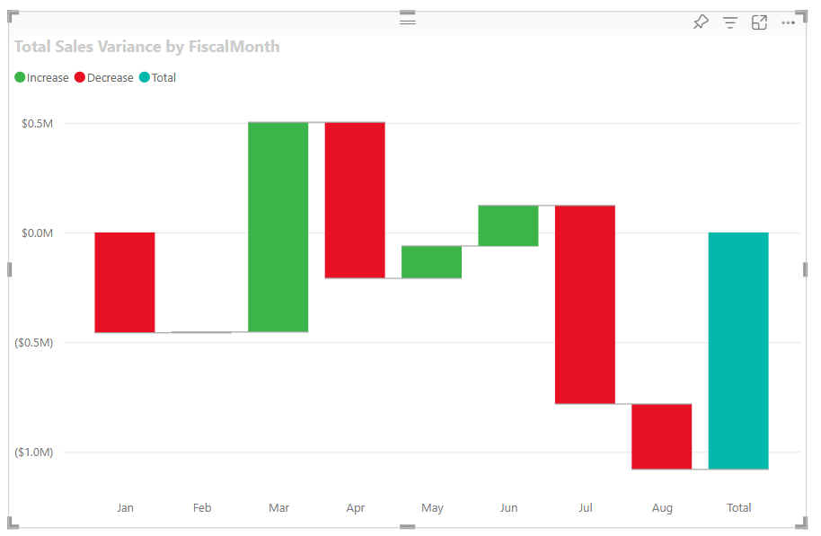
The purpose of your main visuals is to clearly and succinctly communicate whatever point you are trying to make. Sales over time. Changes in market share. How the launch of a new project is going. Someone should be able to look at them and it should be abundantly clear what the trend is. Simpler visuals are better. I know that waterfall charts are sexy, but bar graphs and line charts are >80% of the visuals I use on a daily basis.
I use cards to show information that reinforces whatever I am trying to communicate with my main visuals. Usually this means determining what specific metrics or statistics reinforce your point, creating DAX measures that will calculate these statistics and using these measures on cards. If you’re report is all about sales it might be total sales of your top-selling product or the delta percentage over a year or quarter.
Slicers are what make your report dynamic. Remember your data model? You should have slicers for each dimension of your data model, and your slicers should be connected to the dimension tables, not to your fact tables.
An Example
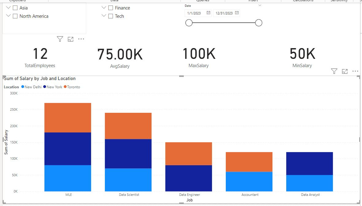
This is what I mean by effective communication. This page is a very basic HR Power BI report. I created this off of the data model created in the Data Modeling Post with a few additional DAX functions beyond what I created in YYY.
(For extra credit, create DAX functions for total employees, max salary, min salalry and avg salary).
I have slicer at the top and by selecting slicers, I change my visual and the information reflected on the cards which contain DAX measures.
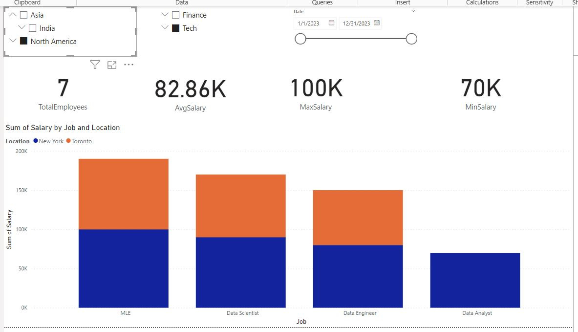
By looking specifically at tech workers in North America, total employees, average salary and minimum salary have changed. But this report isn’t finished. The problem is this report is REALLY ugly.
Building Aesthetic Reports
Report aesthetics really matter. So I’m going to give you some guidelines for building aesthetic reports. Once you have these guidelines in place, going from a fugly report like the one above to a beautiful report like I’ll show at the end of this post shouldn’t take you more than an hour or so. This is a three part process:
Ideation/Inspiration
Themes and Color
PowerPoint and Background Images
Power BI Report Inspiration
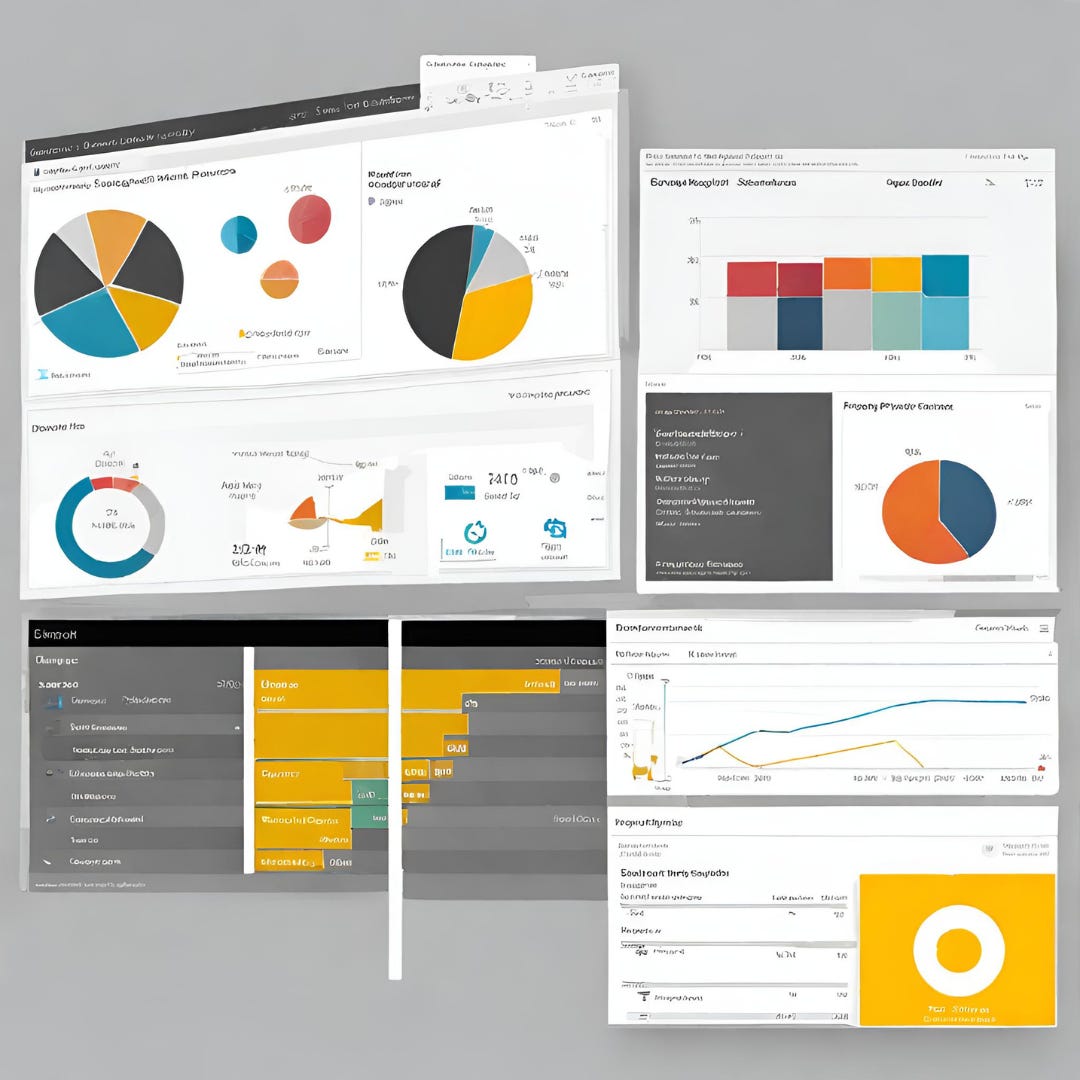
I gave an example above on how I like to lay out a report. But sometimes I need to go beyond that. The issue is, I’m not a creative person. UX isn’t my strong point. BUT when I need inspiration for my Power BI reports I do have a few places I can go that curate a TON of aesthetically pleasing layouts. They are:


All three of these images I found on Freepik in under a minute. Freepik has thousands like them if you need any inspiration at all. Adobe is the same way. This is inspiration for HOW to lay out your report.
How to Select Colors for your Power BI Report
Selecting the right colors is another part of creating aesthetic Power BI reports. If you’re working for a F500, they probably have a Power BI theme for you to work with. Power BI themes are stored as JSON files and they standardize report colors, fonts and word sizing or at least set defaults.
If you’re freelancing or just trying to learn Power BI, you have a little bit more flexibility. One option is to can easily select colors themed around the logo/colors of the company you’re working with. You can get the colors in your report to match perfectly using Adobe Color. Its as easy as uploading a photo of the logo.
I got pretty meta here and created a palette of colors for a Power BI themed Power BI report.
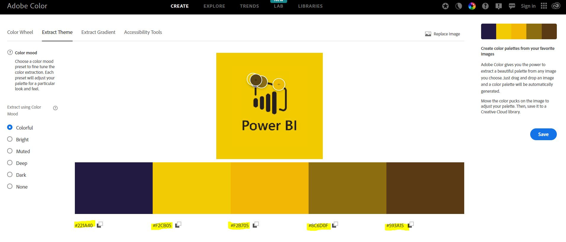
Highlighted at the bottom of the screen is your color codes.
Another option is to generate a color palette is with Coolors. Coolors is slightly less structured than Adobe color but still a great option if you’re stuck on what colors to use in your Power BI report.
Using PowerPoint to Generate a Background
I spent under 5 minutes creating a background in PowerPoint. I created a slide with a title area with the darkest brown (593A15) and a report area with the lighter brown (8C6D0F) and put my Power BI logo in the corner. I saved this slide as an image and now I will add to my Power BI report.
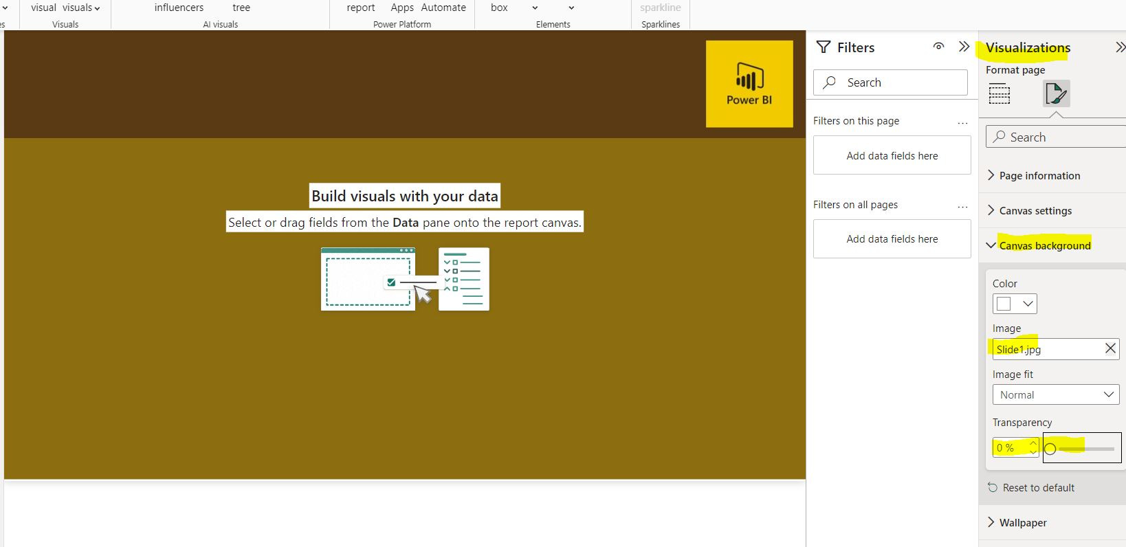
Add by clicking on visualizations and format your report page. Click on canvas background and upload an image of your PowerPoint slide. If you don’t see anything, make sure to check the transparency on your background and set to zero.
Uniform Formatting of Power BI Visuals
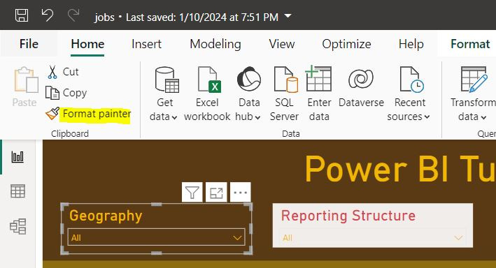
After you have set the background its time to align your individual visuals with your theme. This is easy by setting a single visual with the colors/fonts/sizes that you want and using format Painter. Select a visual with the formatting you want, select format painter and click on the visual that needs its formatting changed.
Bringing it All Together
Here’s the final report for this HR dataset I created.
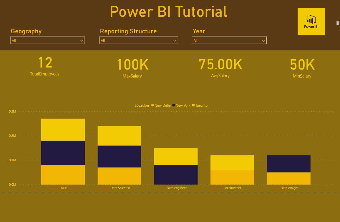
The final report is simple but functional and while the color theme has a little too much mustard in it, it is aesthetically congruent. I have a title and icon at the top. Below this I have my slicers, allowing a user to dynamically adjust the visual(s) on this report page. I have a single visual communicating salary expenditure by location and job. Finally I have cards that dig a little deeper into important HR metrics.