
Visualizing Global Trade: Part 1
Visualizing Global Trade in Power BI

This substack is going in a new direction. I haven’t had time to write or publish in a long time. I have an exceptionally busy life and I don’t want my writing to seem like I fed a microsoft.com Power BI blog article into an LLM.

A follower DM’ed me and offered to pay me for my expertise in developing a Power BI report. He felt stuck in tutorial hell and wanted to watch someone actually work. About 15 minutes into our call, he called me a wizard and I got the idea for this series. This series of posts will be on the total development of a Power BI dashboard. If you follow along, you may even have something to put in your professional portfolio. Here are the subjects of the posts:
Topic Background and Data
Power Query and Data Modeling
Data Exploration and Report Aesthetics
DAX and Visualization Building
Shall we begin?
Visualizing Global Trade: Background
There’s a trade war going on. America has an enormous trade deficit, meaning America imports more than it exports. There are reasons for this. The dollar is the reserve currency. This allows America to be flexible with its spending and run consistently higher deficits because there is always demand for American dollars and American debt which is the promise of dollars in the future in return for other things now. Dollars are used globally to denominate trade.
In the 70s, America made an agreement with Saudi Arabia called the petrodollar. America gave security guarantees to Saudi Arabia in return for Saudi Arabia refusing to take anything but US dollars for their oil, which was a significant portion of world energy generation at the time. This meant that to participate in the global energy market, every country had to had dollars. The best way to get dollars was to run a trade surplus with the United States. Five decades later, America runs consistently high trade deficits (other countries’ surpluses) to power Global trade.
This arrangement has had winners and losers. Among Americans, the losers have been workers who worked in factories, producing industrials other manufactured goods. This group makes up a significant portion of President Trump’s base. There are also questions about sovereignty and security; Can a nation have sovereignty if it relies on others for things required for its security?
Visualizing Global Trade: Data Sources
Now that I’ve given you a *very* brief background on the current global trade system, lets dig into data. I was able to find some incredible data sources for global trade. I made an account for free to access the “advanced query” function of World Integrated Trade Solution. The WITS database is phenomenal. There are a ton of options for naming conventions and granularity for classifying goods hierarchically. There are also a ton of options for pulling difference geographical hierarchies.
At the end of the day, I pulled import/export data from America’s major trading partners by country with the express purpose of rolling that data up to a “trading bloc” level. I pulled the lowest possible level for products so that I can build a hierarchical product table off of that. When it comes to country data, I’m pulling specific countries that make up trading blocks like:
BRICS
USMCA
EU
The “Asian Tigers”
ASEAN
So my data sources are a series of excel files that contain trade data and dimensional geographical data. I have combined all the files into a single zip and uploaded the zip here.
If you’re following along and want to use a similar dataset to me, download the dataset. If you want more control over your data and downstream modeling and visualizations, go explore the WITS database. The data is complete, well-organized and will require very little cleaning/munging prior to building.
Planning Out Visualizations
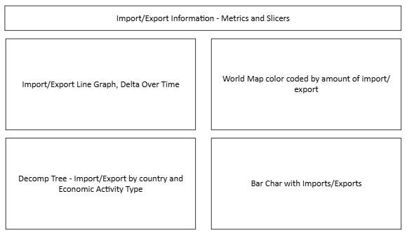
Its never too early to start planning out report design. AI might seem great for making wireframe diagrams, but we’re trying to plan out the structure, not get help with aesthetics/inspo. So instead of using an LLM or Image generator, use good old Microsoft Visio. Remember from my previous post, you want to structure each dashoard with:
2-4 main visuals
4-8 metrics
<8 slicers for dynamism
Here’s where I’m going to start from.
Conclusion
I got a good start on a dashboard. I have an interesting topic. I have all my data picked out. I have a rough plan for visuals. Next time I’m going to get into Power Query and Data Modeling. Go get yourself a refresher on these two subject. Either read what I have written about them previously, or ask any AI for:
A 500-1000 word summary on Power Query in Power BI
A 500-1000 word summary on Data Modeling in Power BI
I think if you follow along, you’ll have a good portfolio piece that should help you land your first job.
Til next time,
-BTA