Power BI Data Modeling for Beginners
Hello, I’m BowTiedAnalyst and this post is on Power BI Data Modeling. I’m a Data Analyst at a F100 company and I’m writing a series on Power BI for BowTiedRaptor. This is part three of a Power BI Overview I am writing. The purpose of this overview is to give you everything you need you create beautiful Power BI reports in as little time as possible.
When I first started working in Power BI, I had trouble wrapping my head around data modeling. Data modeling is what drives the interactivity of Power BI reports. Data Modeling is comparable to building a schema relational database. Once built your data model allows you to slice and dice data and drill down into interesting trends.
Understanding how to build a data model rather than memorizing how to build a data model in Power BI requires understanding of the history and evolution of data storage and why things are stored the way they are. This post will give you some theory behind data modeling and then jump into practical application of data modeling in Power BI. If you are already familiar with things like Tidy Data and Normalization, you can skip to the “Important Concepts in Power BI Modeling” section.
Data Storage History and Theory
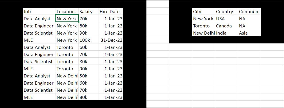
An excel file has rows and columns. The way that I thought about data before working with data is that there really isn’t any organization to how rows and columns fit together. Pretty much anyone who doesn’t work with data stores data in excel files in an unorganized manner like the image below. And this is a terrible way of storing data.
A much better or rather TIDIER way of storing data was written about by an R (not python, congrats Raptor) programmer. You can read the full paper here if you’re interested but the basic thrust is that each each row is an observation and each attribute of the observation is a column. This is exactly how data is stored in relational databases. Taking the table above, instead of having 4 rows for jobs and 3 columns for countries with each data point being a salary, we not have 3 columns: job, city and salary and 12 rows each of which is an observation (note that this is what the PIVOT/UNPIVOT functions in Power Query do).
Tidy data also allows you to easily add more information to your data. In the “typical” way of storing information above, how would you add information like hire date? You couldn’t. With tidy data, its as easy as creating a new column.
Now some attributes can have ranges of generality. For hire date, a specific date can refer to that date, or that month, or that quarter, or that year, decade, and so one. The general attribute of date/time has a hierarchy of generalized values that can all be derived from the first value. And you may want to see information based on any part of that generalized hierarchy.
The year column is this table is redundant. I have 11 instances of 01JAN23 as a date and the year is the same for all of them. This is wasting memory space and updating every instance of this is more computationally intensive than updating just a single instance. For 11 instances its not a big deal, but what about 100,000 or 100,000,000?
The solution to this is NORMALIZATION where hierarchical data is separated into multiple tables with keys that point to each other. So instead of updating a million instances of date and month and quarter and year, only a million instances of date are updated in your fact table.
In this example you have two tables, a job table and a geography table and you connect your geography table to your job table using keys, specifically a foreign key in the job table location column and the primary key which is the city column in your geography table. If you need additional dimensional information, you match the key of your fact table with the key of your dimension table and combine them as needed to get the additional information. This is what JOINS do in SQL and what Power BI Data Modeling does is provide a low-code alternative.
Here’s a thought experiment. If Donald Trump becomes president and annexes Toronto and liberates Raptor from the oppressive taxation regime of Canada, we would need to update the table. In a de-normalized table, we would have to update the country corresponding to Toronto from Canada to US four times, in a normalized table we would only update the country one time in the geography table.
Important Concepts in Power BI Data Modeling
There are two types of data tables or entities in Power BI, fact tables and dimension tables. Fact tables are like the tidy data tables I showed you earlier, they record a specific event. Dimension tables record additional information about a specific dimension of a fact table. A dimension can be anything, but the three types of dimension tables I often see are:
date/time
geographies
product hierarchies
Hierarchical data is stored in dimension tables which are connected via keys in the data model to fact tables. Now you can easily manipulate the data in your fact table by data in your dimension table without worrying about overly redundant data.
Star and Snowflake Schema, Normalization and De-Normalization
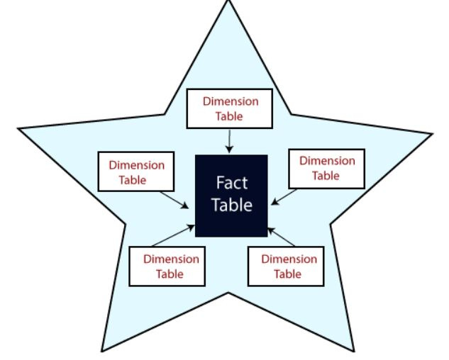
When you build a data model it should follow one of two patterns, either a star schema or a snowflake schema. A star schema has a central fact table and dimension tables coming off of it, like a star.
A snowflake schema has a central fact table and dimension tables coming off of it with dimensions being further broken down with additional dimension tables. Thinking back to the geographical hierarchy example, you could have a fact table that contains different cities, then a dimension table that contains different countries and another dimension table coming off of the first that contains different continents.
A snowflake schema can be contrasted with a tidy data table that has columns with redundant data in that they are opposites. A snowflake schema is fully normalized whereas a wide (but tidy) data table is fully de-normalized. A star schema is somewhere in the middle.
Building a Data Model in Power BI
In Power BI a data model consists of multiple data tables or entities which are related by relationships. A relationship is between one specific column in each data table. Relationships have two attributes:
Cardinality
Cross-filtering direction
Relationships can also be active or inactive in the data model.
There are three types of cardinality:
one-to-many
one-to-one
many-to-many
The cardinality refers the number of values/records in each table associated with each other through a relationship.
There are two types of cross-filtering:
Single
Bi-directional
Cross-filtering direction allows the selection of one table to impact the data of another table. This flows through visuals and selecting specific data in one visual will change the data displayed in other visuals. It helps users analyze and explore data interactively by applying filters across different visuals.
Back to the Example
Remember the example, we have a “fact” table or the inner part of a star schema and a dimension table that provides information on a geographical dimension. Dimension tables are typically related to fact tables in a relationship with one-to-many cardinality. The cross-filtering direction defaults to one-way, propagating from dimension to fact table but can be set by the analyst.
To view your tables and data model you can click on the model view on the right hand side of your screen.
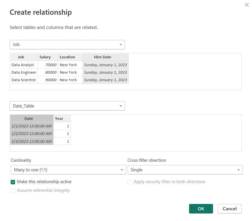
You can click on manage relationship to create relationships between columns and toggle relationship attributes and activity. When you click on “manage relationships” you can either click autodetect or set up relationships manually. I like to set them up manually so that I know exactly how the data model functions.
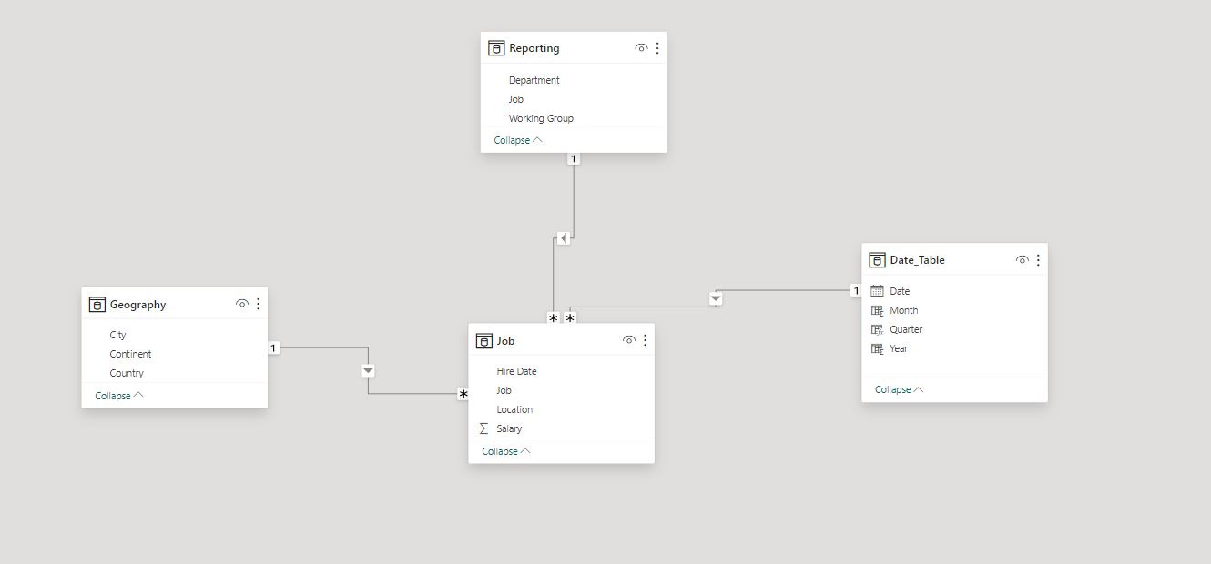
I created a relationship between the hire date column of the job table and the date column of the date_table table. There are many hire dates connected to one date, the cross filter direction is single and the relationship is active.
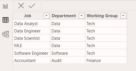
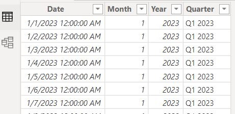
I’m going to add two more dimension tables, a date table, which was I gave a DAX formula to generate in connecting data to Power BI and a reporting hierarchy which put a job in a division in a working group.
Each of these additional dimension tables will have a relationship with our fact table in our data model.
Breaking Down a Data Model
When looking at this data model you can see a central fact table connected to three dimension tables. Each relationship has a “star” connected to the fact table and a “one” connected to the dimension table. This represents cardinality with star being many and one being 1. Each relationship also has an arrow pointing from the dimension table to the fact table representing the direction of cross-filtering. Finally each relationship line is solid representing that the relationship is active compared to a dotted line that would represent inactive.
DAX and Data Modeling
While cross-filtering and activity vs. inactivity are set in your data model, you can change these with DAX for a specific calculation. The only reason I have done this is if I have multiple dates in my fact table. If you’re creating a report for an ecom store like Biom you might have multiple types of dates associated with your dashboard, like purchase date, ship date. You can only have one active relationship between a fact table and a specific column of a dimension table or your model breaks. Purchase date would make sense as its more important than ship date. If you want to drill into shipping you can use DAX to deactivate the purchase date-date relationship and activate the ship date-date relationship.
Conclusion
Putting it all together, the dimension tables all filter the fact table and have all the relationships in this model have one-to-many cardinality where there is one instance of a dimension that corresponds to many instances of a fact.
You have all the information you need to try building out this (simple) data model. Give it a go and direct any questions you may have to BTA.


