
7 Tips for Understanding Power BI Dashboards

A few days ago I answered a question on Reddit. The question was, “I got my first role, I have some dashboards and the documentation isn’t great, how can I piece together everything in my head?”
This is a common issue for new analysts. I remember going through this when I started my first analytics job (over two years ago now, wow!).
Here’s the basic process that I went through with every report I was responsible for:
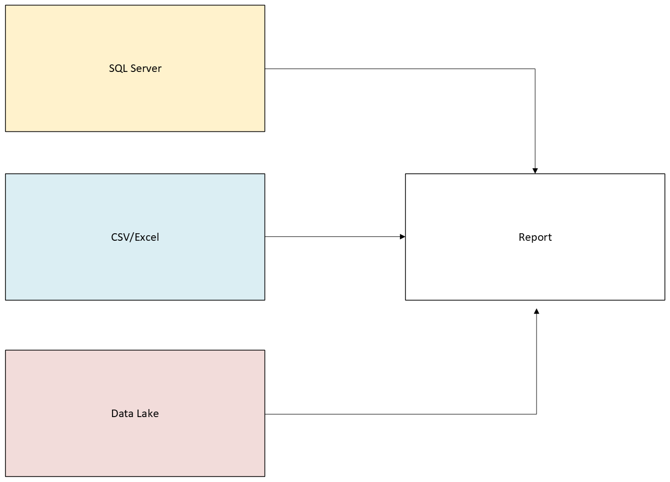
Understand how data flows into each dashboard.
Understand what transformation steps are in Power Query.
Understand the data model in Power BI.
Understand DAX measures/Calculated columns.
Understand how each of the visuals on each page work and what columns/measures power them.
Understand the purpose of each page, what part of the overall story is a page telling.
Understand the purpose of the dashboard as a whole.
I’m going to walk you through each of these steps now.
Understand How Data Flows into Each Dashboard
Your first task is to understand how data flows into each dashboard. This can be as easy as knowing the connections (SQL database, CSV/Excel file, Microsoft Fabric Lakehouse, etc) or as complex as a manual multi-step ETL process that YOU are responsible for running whenever you get new data.
You might be lucky and have a team of data engineers that provide you with the infrastructure that orchestrates and executes ETL, or you might be unlucky and have to spend four hours copying/pasting tablular data into excel sheets. Honestly if its the latter, you have a great opportunity to get your hands dirty with some coding to automate the process which is something you can put on your resume once you’re ready to make the jump to Data Science, Data Engineering or Machine learning.
Regardless, you need to understand what structure your data is in when you connect to it with Power BI.
Understand What Transformation Steps are in Power Query
Data transformation can (but doesn’t have to) occur prior to connecting to your data. Power Query offers a low-code/no-code environment to perform transformations in as well. Understanding what is happening in Power Query is step two in building an understanding of Power BI dashboards.
For each data source being brought in, specific things are being done in order to build out data tables which are fed into your data model and eventually power your dashboard and deliver insights required by your end users and stakeholders.
Understand the Data Model
Next you need to understand the data model. Here are some questions to ask and answer in order to understand the data model:
How are the tables connected?
What is the purpose of each table?
Do you have a single “fact table” or multiple? Do you have any “filter tables” that mimic SQL subqueries?
If you have dimension tables, is every foreign key from your fact table matched to a primary key in your dimension table?
The last question especially can lead to trouble because if you have a “select all” option for a filter in a dimensional table column, you’ll select **ALL** rows of your fact table (including “blank” values) which can throw off metrics if you’re metrics have any aggregations.
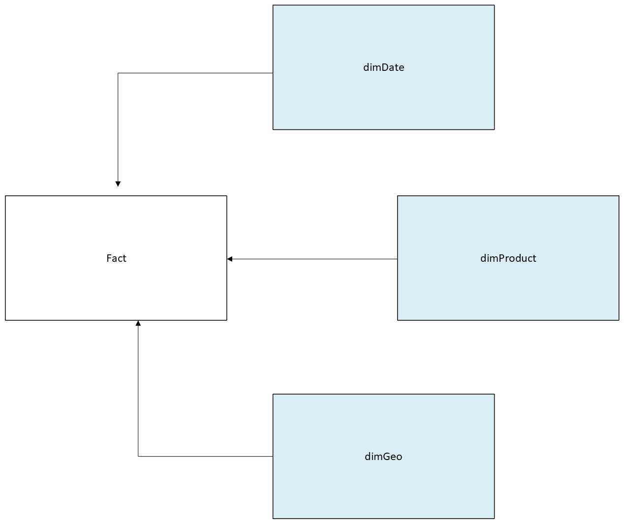
Data models, especially for older reports, can be a tangled mess. You need to understand the model to understand how data is transformed into insight.
Understand DAX Measures/Calculated Columns
You need to understand the DAX measures and Calculated columns in your Power BI dashboard. DAX ha an enormous range of use cases, but in my experience, 90% of it should be filtering and aggregating.
Measures are much easier to understand if they’re written using VAR/RETURN statements, but sometimes instead of using VARs, inexperienced developers will just write multiple measures that cascade into each other.
You should avoid this because it makes troubleshooting an absolute nightmare. Anyways, you need to know what your key DAX measures do and how they are used. LLMs are useful for figuring out what unknown measures do.
Understand How Each of the Visuals Work and What Columns/Measures Power Them
What are the important visuals each page and how are they built? You need to know what the key visuals are and how they function in order to know if they’re working properly and if there are adjustments that need to be made during updates.
There are usually just a few main visuals per page. Each of these visuals has a few measures/columns that power them. Apart from these visuals, there are also metrics and/or tables which might have 1-2 measures/columns. There are also filters/selectors on the page that the user can select as well as a filter section that the developer can control.
Understand the Purpose of Each Page
What is the role of each page? What are you trying to show? What are the needs of the user? How can you make it easy to use and obvious?
The answers to these questions allow you to make changes to visuals to better tell the story that your dashboard is trying to tell.
Understand the Purpose of the Dashboard as a Whole
What’s the purpose of the overall dashboard. What are you trying to communicate? Sale patterns to the sales team? Market share to the marketing team? R&D information to engineers or manufacturers. You need to be communicating with your users and stakeholders and refining the dashboard to serve its purpose. Don’t be afraid to split a dashboard into two if you have multiple teams that need it for different things.
Conclusion
This is how you orient yourself as a new data analyst whose just been given responsibility for some Power BI reports. You can also apply this (with some tweaks) to Tableau reports or really any analytics project you are responsible for.
The general rule is to break things down into component parts that you understand and to understand how the various parts that go into your finished analytical product fit together to give your stakeholders what they need to do their jobs.
There are ways to specifically automate a lot of these processes. There are SaaS Apps that help you to understand Power BI reports. You can also write a python script to scrape the JSON of a PBIT (Power BI Template) file. You can also use DAX INFO() Functions to show you information about the data model or measures.
Those are beyond the scope of this post, but I’ll write something soon on using Python to scrape metadata from Power BI reports.
Until then,
BTA